College Logos - Visual Integrity
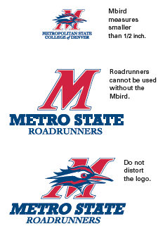
These logos have been specially drawn and the letter and word spacing as well as line weights and lengths carefully determined. Therefore, the logo should not be altered or distorted in any way and should always be in the styles shown.
For maximum clarity and visibility, care should be taken to ensure that the logo is always readable and that other images or design elements do not visually interfere. The logo should appear in its entirety and should not be combined graphically with another emblem or symbol. Type appearing on the same surface as the logo should not touch the logo or be superimposed over it.
Minimum size: |
If space available does not allow the College logo to be printed at or above the minimum size, use of the College wordmark is acceptable. However, all situations requiring use of the wordmark instead of the logo must be approved in advance by College Communciations.
To get a copy of Metro State logos
For direct reproduction of the Metro State logos, use only images of the logo that are of reproduction quality; these are available here.
Do not print or reproduce the wordmark from a previously photocopied version.
Unacceptable Logo Examples